Open topic with navigation
Managing Devices and Resolutions
To aid users in visualizing what your content will look like in devices other than a standard desktop or laptop machine, you can use the Site Editor Device feature to preview how content will look on a certain device size. This work with both standard content and with Audience Segments.
Before they can used, devices must be set up in Manage Devices screen. Three devices appear in the admin by default, web (standard laptop/desktop), tablet and phone.
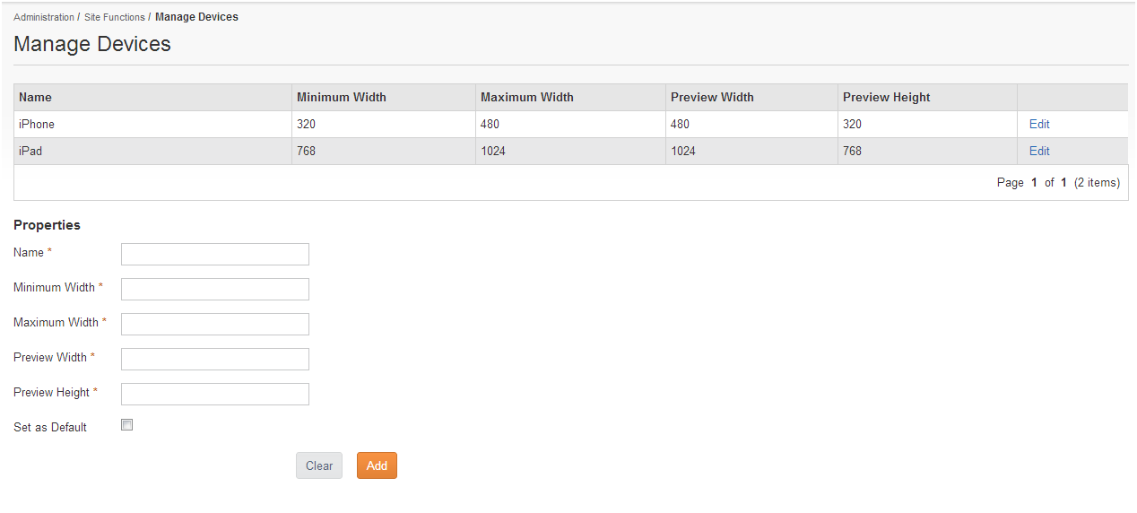
To reach Manage Devices, go to.
Administrators can add other devices if wished.
- Each device will have both a minimum and a maximum width. This is the width between which any configured Audience Segment content will show for that device.
- For example, the default smart phones sizes are 320 and 480. Only devices uses a screen width between 320 and 480 pixels will see the smartphone content. devices with a width larger than 480 pixels will need a different device configured for them.
- There is also a Preview Width and Height. This is the size that will be used while previewing content in Site Editor, and should be a typical size for the device. You do not need to use audience segments to preview on a device size.
Adding a new Device
To add a new device:
- Fill in the properties at the bottom of the Manage Devices screen, and click Add.
- The device will appear in the list of devices at the top of the page.
See "Devices and Audience Segments" for more on how the device preview works in Site Editor.