To design the layout of a form, follow these steps:
• Follow the step for creating a new form (See "Adding / Editing a Form") or click on a form in the Forms Library list and click the Edit button.
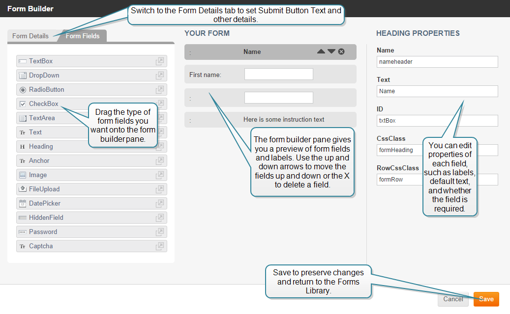
A Form Builder window appears displaying three columns:
 Adding Form Fields
To build a form:
The Form Builder provides the Form Fields described in the following table:
| Form Field | Description |
|---|---|
| TextBox | A text field for user input |
| drop-down | Drop down pick list. |
| RadioButton | Two option radio button list |
| CheckBox | Two option check box list. |
| TextArea | A text box for user input |
| Text | A text area to display text information such as directions on how to fill out the form. |
| Heading | A heading area to display information |
| Anchor | Anchor to make this form the target of a link. |
| Image | Area to display image. |
| FileUpload | File selection field and browse functionality to upload a file. |
| DatePicker | Date selection field and calendar display functionality for user to input date. |
| HiddenField | Field that does not display to user, but allows you to add information for working with form in background. |
| Password | Field for user to enter password. |
| captcha | Adds challenge-response functionality between user and form. |
Drag any additional Form fields into the Form Builder pane to build your form.
Before you finish with your form you need to specify Form Field Properties for each field in the form.
Specifying Form Field Properties
The properties specify names, labels and other aspects of the field’s behavior.
When you drag a field into the Form Builder pane, or click on a field already in the pane, properties for that field display in the Properties column. Not all fields have all the properties. What each property does is described below.
| Property | Applies to Form Field | Description |
|---|---|---|
| Name | All | Enter a non-displaying name by which you can reference this field. |
| Label | All Except: Text, Heading, Anchor, Image. | Enter a label to appear beside this field that identifies the function of this field to the user. |
| ID | All | Enter a non-displaying ID by which you can reference this field. |
| CssClass | All | Style class |
| RowCssClass | All | Style class |
| Required | All Except: Text, Heading, Anchor, Image, HiddenField, captcha |
Specifies whether a user is required to specify input in this field. • Click arrow in pick-list to choose true (default) or false. • True = required. • False = not required. |
| Validation | TextBox |
Specifies method by which field gets validated. • Click arrow in pick-list to select method. • Methods include: Alphabetic, Numeric, AlphaNumeric, Email, Zip, Phone |
| RegEx | TextBox, Password | Enter a regular expression to use for pattern matching, if desired. |
| DefaultText | TextBox, TextArea, DatePicker | Text to display in field when empty of user input. |
| MaxChars | TextBox | Maximum number of characters that a user can enter in this field. |
| Items | drop-down, RadioButton, CheckBox | Labels for options displayed in drop-down, RadioButton, or Checkbox. |
| OnChange | drop-down | Action to execute when OnChange event gets triggered. |
| Text | Heading | Text that displays in a bold font. |
| OnClick | Anchor, Image | Action to execute when OnClick event gets triggered. |
| Src | Image | Path and filename of physical image file. |
| AltText | Image | Text to display when Browser cannot display image. |
| IconPath | FileUpload, DatePicker | Specifies image file path for button displayed as part of this field type. |
| Format | DatePicker |
Specifies required date format. • Click arrow in pick-list to select format. • Formats include: mm/dd/yy (default), dd/mm/yy, d MM yy, DD d MM yy. |
| CustomFormat | DatePicker | Specifies a custom date format to use instead of the Format property options. |
| Value | HiddenField | Specifies default value for Hidden Field. |
| Special | HiddenField |
Specifies Hidden Fields • Click arrow in pick-list to select option. • Options include: None (default), PageUrl, PageTitle, Date, IP. |
Once you have finished with your form fields and specified their field properties you can save the form by clicking Save.
You may want to go back and edit some of the details for the Form itself (if you want to add a particular email subject line, for example.) In that case, edit the form and click on the Form Details tab.
|
iAPPS is a product of Bridgeline Digital
|
